
Mirror e-Commerce Site

Final Prototype

Overview
Client
Passion Project
My Role
UX/UI Designer and UX Researcher
Duration
80 hours
Introduction
Mirror is a (fictional) budget friendly clothing store founded in 1994 geared towards finding low-cost clothing for any occasion. They have over 400 stores in 32 countries and are very successful offline. Given the sales opportunity and a large number of customers asking, they have decided to expand to e-commerce.
The Challenge
This project is to give a complete refresh to Mirror and to complete user research in order to uncover design opportunities based off of needs of users to create a responsive website with a new logo since they are late to entering the e-commerce market making this a completely from scratch effort.
The Solution
The result of this project was a responsive website that reflected Mirror’s modern style prioritizing usability.
Research

Goals
Interview users to discover how and why they use e-commerce for clothing
Understand shopping features that users value
Discover common pain points
Learn about features users wish e-commerce had and the reasoning behind them
Competitive Analysis & Personas
Conducting a competitive analysis allowed me to analyze the strengths and weaknesses of Mirror’s competitors i.e., Target, Forever 21, Zara, H&M, and JCPenny. Here were some of my main takeaways:
Clear pages with clear categories create for a more user friendly and streamlined experience
Having an easily visible navigation bar is important
A large variety of categories makes it easier to find specific items
Accessibility is important
Too much information isn’t more helpful, it detracts from the products
1:1 User Interviews
3 users participated
1 male and 2 female participants were interviewed
Participants ranged from ages 27-57
All users are based in the United States
Users had the following occupations:
Social Worker
Psychologist
Actor

Interview Summary
All users were drawn to online shopping so that they can browse prices and view items all in one place
All users liked when there were reviews of a product and wanted more of those
All users want a streamlined experience
Two users brought up wanting to be able to see dimensions and measurements
One user said they like when there are savings easily found and when promo codes are easy to add

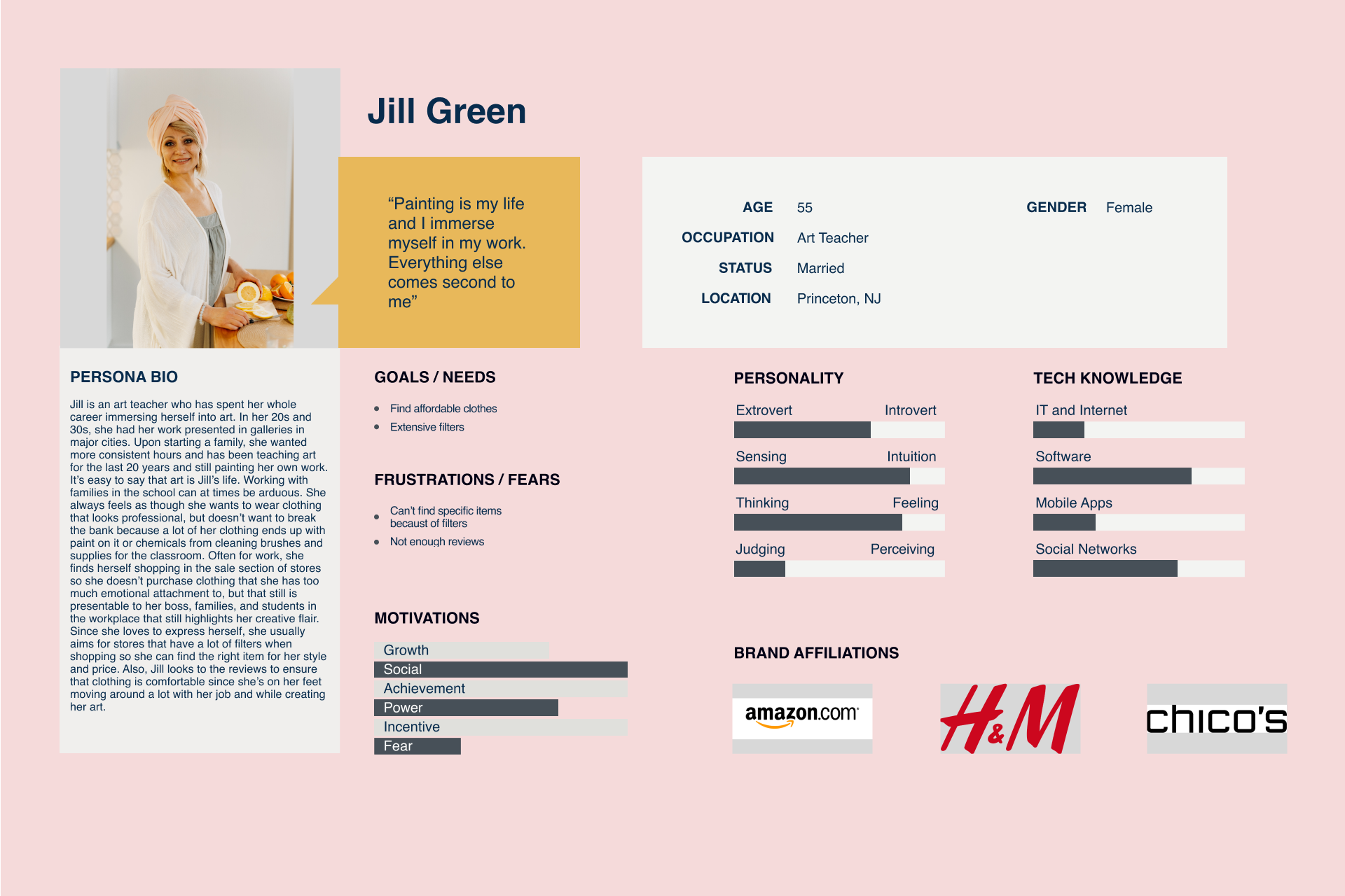
Defining the User
Below is a persona helped me ideate what embodies a typical user of Mirror and what types of behaviors they might partake in and the motives behind them.
Design
Many of the competitors had similar layouts in terms of information architecture and visuals due to achieve a common goal: to direct the user to easily purchase products. To showcase my information architecture and visual design, I completed the following:
Information architecture
Wireframes
UI Kit and Branding
Prototype

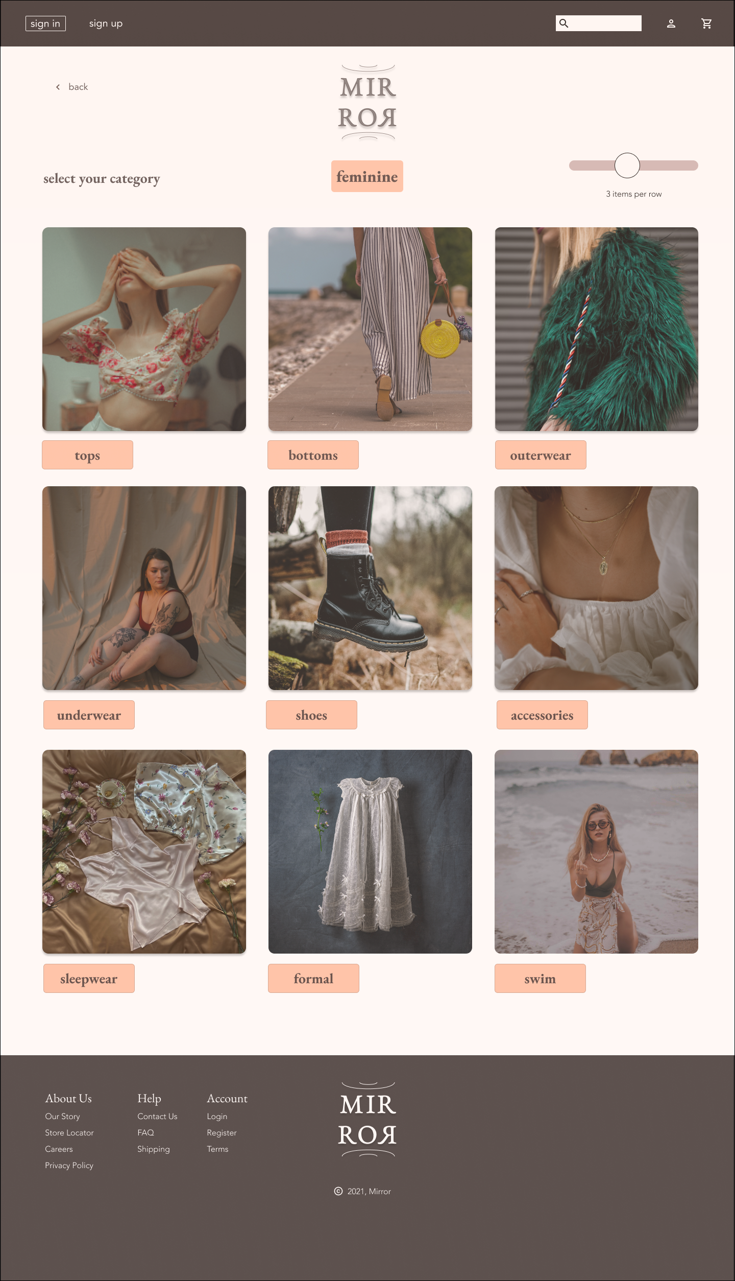
Information Architecture
To build a sitemap of Mirror’s website, I needed to receive insight into a user’s categorization and grouping through card sorting. I was able to conduct card sorting remotely due to the COVID-19 pandemic and created the site map from the results. From here, I was able to create wireframes.
As a member of the LGBT+ community, it was important to create categories of “masculine” and “feminine” to create a more inclusive feel.
Low Fidelity Wireframes
UI Kit and Branding
Each of these image clicks to expand in a Google Drive file

Hi-Fidelity Wireframes

UI Kit


Usability Testing
I conducted four usability tests, two remote, and two in person. Participants were between the ages of 25 and 60 years old. I conducted this testing with people within my network in the following steps:
Create a prototype
Usability testing
Analyze findings
Iterate based on findings
Each of the below images click to expand in a larger Google Drive file.


In my usability testing, I created a prototype for users to complete two tasks:
Find a feather dress in white and in an XS size
Add the feather dress to the cart and begin the guest checkout process
Key takeaways:
Other than Participant 1 trying to use the search bar for the item and participant 2 trying to click on the image itself, there were not many navigational issues.
In both instances of Participant 1 and 2 initially having a navigation issue, they were able to self correct the issue.
No major critiques of the prototype as a whole
Revisions:
Due to the participant who thought to search for the item, I reformatted the landing page to be have the category buttons and call to action a bit higher up the page so that they are more easily seen
Regarding to the participant that initially clicked on the image instead of the button on the category page, I put the button over the image so that it is a more streamlined visual
Link to view enlarged image: https://drive.google.com/file/d/1nWv_kwkI2DfDPpAe0OTcftdavFrX6_oq/view Final Product
Conclusion
This project was an opportunity where I conducted research in order to create an effective e-commerce platform that allowed for a streamlined user experience.
All and all, the users seemed happy with the prototype. Other than a couple of suggestions that I integrated, I am feeling confident in the user experience and interface of this prototype.
In the future, the critique I received helped me to think in a big picture in terms of UI and to work more with scaling so that users can more immediately be drawn to interact with the interface as a whole instead of quickly choosing to search for an item.